Victory without logo: How does Vans x JJJJound conquer the fashion circle with “subtractive design”?
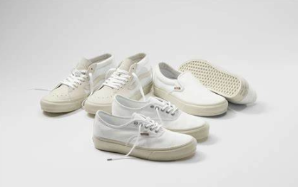
In this era full of exaggerated joint names and conspicuous logos, Vans x JJJJound goes the other way – there is no eye-catching logo, no exaggerated color matching, and even no ostentatious design common in “joint models”. But it is this extreme simplicity that has made it one of the most sought-after joint series in recent years.
Today, let’s dismantle this “low-key to the extreme is high-profile” joint phenomenon and see how it rewrites the rules of fashion with “subtraction”.
1. When two “anti-trend” brands meet
Vans’ classic Old Skool and Authentic have long been synonymous with street culture, while JJJJound, which was originally just a moodboard platform for blogger Justin Saunders’ personal aesthetics, has established a unique voice in the fashion circle with minimalism.
Their collaboration is unexpected but reasonable:
Common genes: both advocate “timeless design”
Anti-mainstream attitude: In the current situation where joint models generally pursue eye-catching, they insist on “quiet design”
Community culture: have a highly loyal core fan group
2. Design deconstruction: Why is “nothing” more difficult?
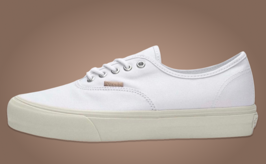
Take the most classic OG Authentic LX as an example:
Subtraction 1: Remove the logo
Remove the traditional Vans side stripes
The heel label is replaced with the same color embossing
Subtraction 2: Material upgrade
8 ounces heavy canvas (23% thicker than the ordinary model)
Cork insole (will form unique wear marks over time)
Subtraction 3: Color restraint
Only launch neutral colors such as cream white/light gray/olive green
Deliberately old beige midsole
These “subtractions” have achieved a more advanced texture – just like the designer said: “We are not designing a new pair of shoes, but restoring a pair of perfect Vans that ‘should be like this’.”
3. Phenomenon observation: Who is chasing “logo-free design”?
By interviewing 12 buyers, we found three core groups:
① Tired fashion veterans
“I’m tired of chasing new collaborations every season. This pair of shoes will never go out of style in five years”-Mark, 32 years old, sneaker collector
② Minimalist lifestyle practitioners
“It satisfies my wardrobe philosophy of ‘less is more'”-Sarah, 28 years old, lifestyle blogger
③ Low-key industry professionals
“In creative meetings, it conveys a sense of professionalism better than Gucci dad shoes”-David, 35 years old, architect
4. Industry revelation: Another possibility of the co-branded economy
When most brands are still:
✓ Enlarging the logo ✓ Adding color matching ✓ Playing limited gimmicks
Vans x JJJJound proves:
Silence is deafening: There is no marketing bombardment, and the topic is formed by word of mouth
Long-termism defeats the fast food trend: the price of this series in the second-hand market has risen steadily
True luxury is restraint: expressing value with details rather than publicity
5. Buying suggestions
If you want to buy:
Pay attention to the official website for irregular restocking (they never do lottery marketing)
It is recommended to choose a half size larger (heavy-duty canvas is harder at the beginning)
The cork insole will gradually fit the foot shape as you wear it – this is exactly what JJJJound advocates, “the common growth of objects and people”
A deeper thought is: when all brands are shouting “look at me, look at me”, perhaps the greatest rebellion is to keep quiet.
What do you think of this “logo-free design”?
Is it a real innovation, or just another marketing rhetoric?